Pavilion
Despite growing up close to the countryside in a town, I have well and truly morphed into a city woman. I can parallel park in spaces a badger hair-breadth longer than my car. I can disperse a flock of footless pigeons with a flick of my Converse. I can suck in deep breaths of the smog washing over me from the Westway without a cough.
Sure, I miss the horizon and the green (plants? Trees, is it?), but I love London. For so many reasons, of course, but the annual Serpentine Pavilion is definitely up there on the list.
Since 2000, the year I came to live in London, the Serpentine Gallery in Hyde Park has commissioned a temporary summer pavilion by a leading architect. I love the regularity and predictability of it. An annual marker of the summer months. The fun of it, the joy of it, though, is that it is a surprise gift. You never know what you're going to get. I sound like Forrest...
Some years I love it. I rarely hate it. The "meh" years are frustrating.
We often end up visiting more the once. As we usually go with the boys, it's difficult to fully appreciate it when you're trying to keep two escape monkeys in your peripheral vision. But it's good to see how children use the space, too. Interestingly, their favourites are usually our favourites. Spike still remembers the Fujimoto pavilion from 2013. We loved that pixelated cloud. It was so interactive. In my old age, though, I do prefer the structures to offer shade.
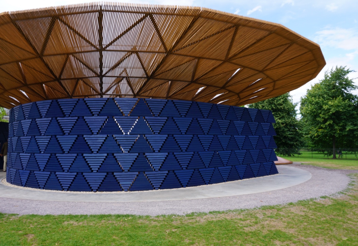
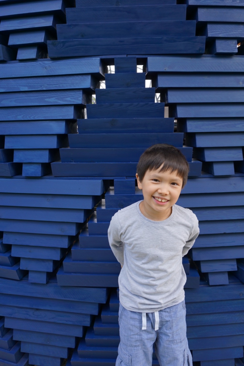
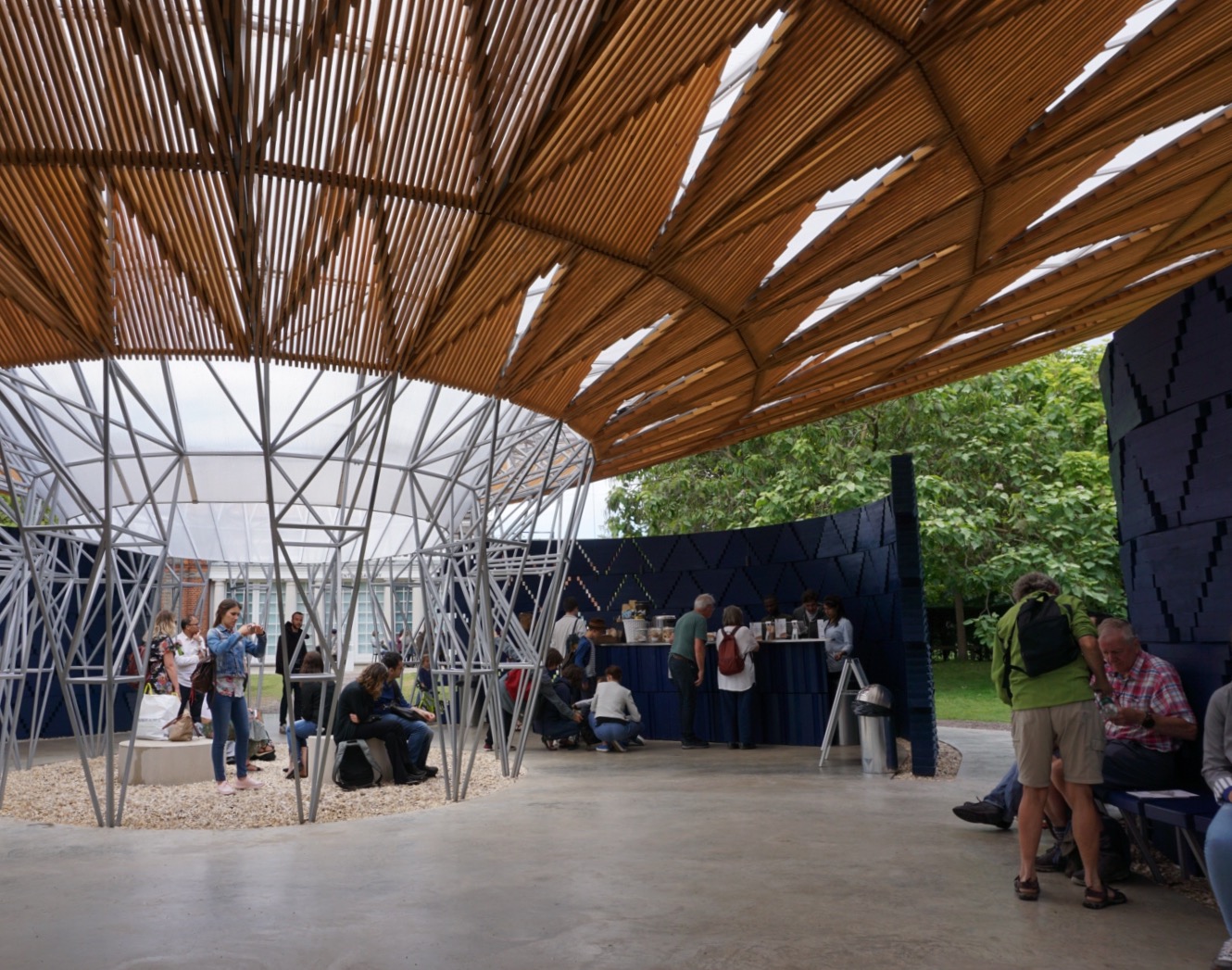
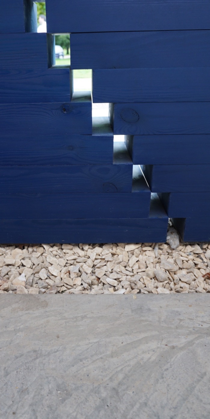
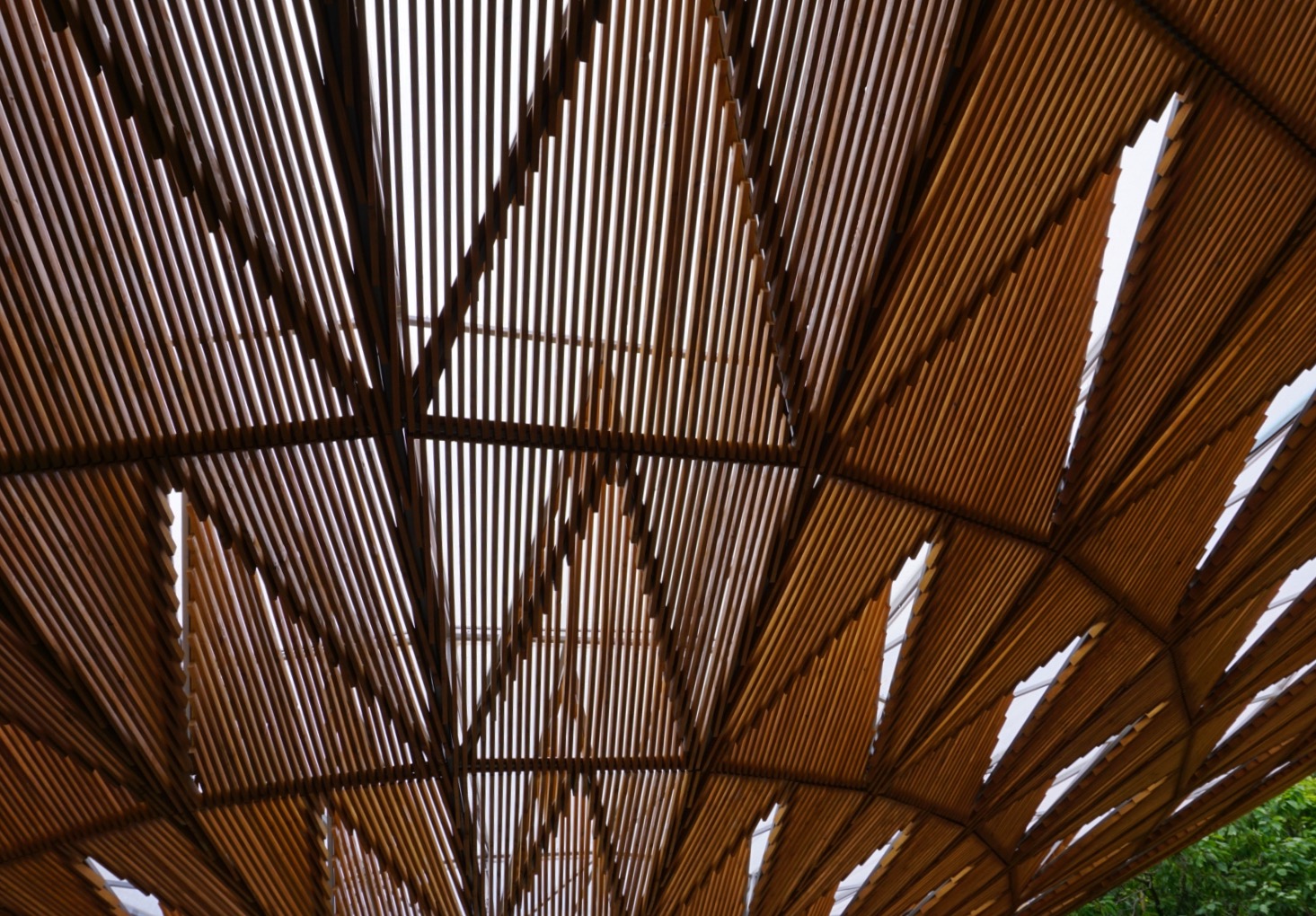
We were a bit late to this year's pavilion, designed by Diébédo Francis Kéré, but it was worth the wait. Kéré says he was inspired by a tree which served as an important meeting point in his village in Burkina Faso. That inspiration is pleasingly apparent in the design, lending it a wholesome and welcoming atmosphere. The structure is resplendent in lapis lazuli blue, a culturally-significant colour for Kéré.
The frondy, geometric funnel roof is fabulous and casts needed shade on the open lawn. The polished concrete floor is agreeable and tactile. Triangles and curves recur and help move your eye around the structure. But it was the perfect blueness that stuck with me.
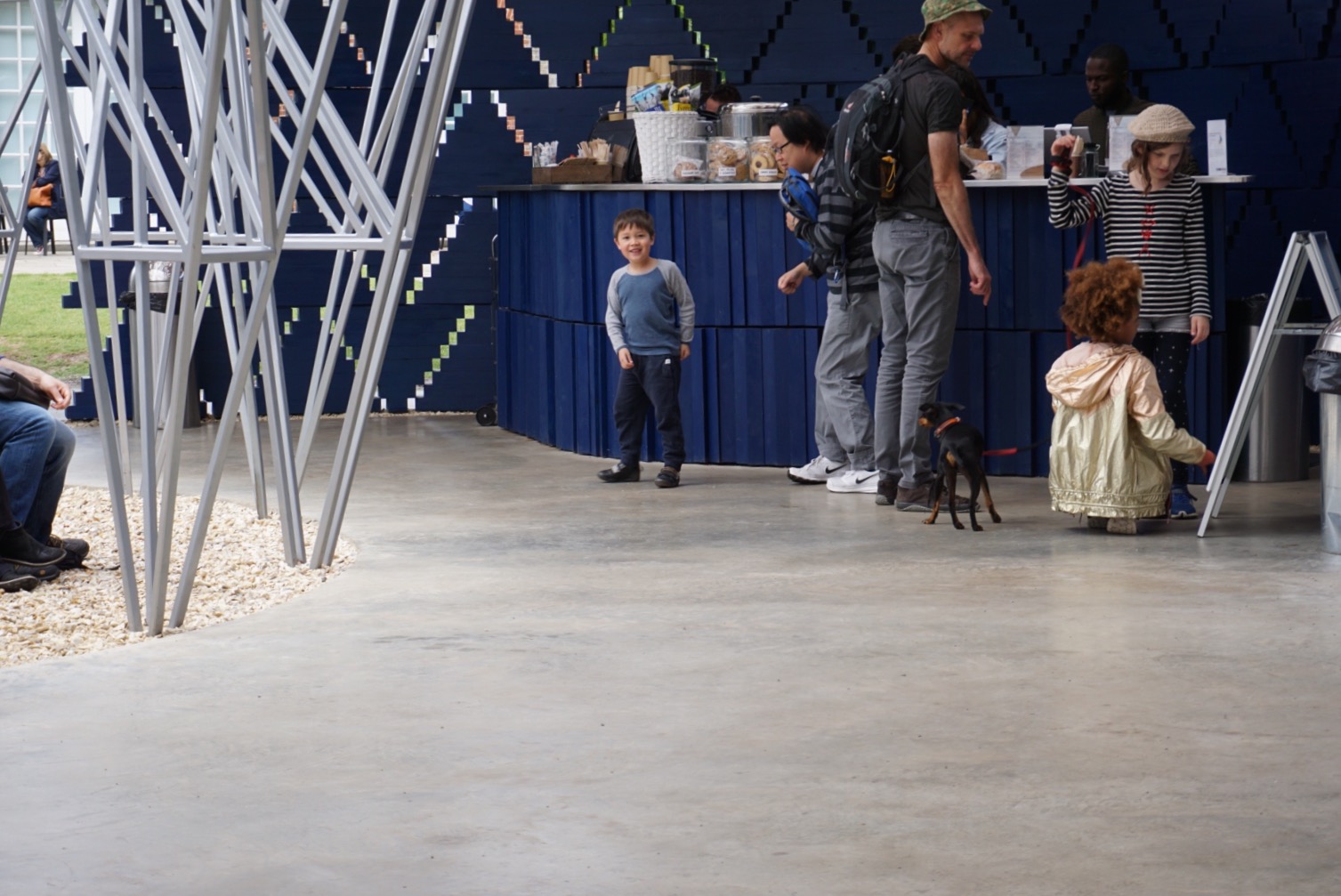
The cafe in the pavilion is usually spendy but good. This year was no different, and we enjoyed our little floor picnic inside this glorious in-out building. Being the fine arbiters of architecture that we are, we all declared it a success.
Make the pavilion part of your year, if you don't already.
Some photos from our visits to previous year's pavilions.
2009
2011
2012 (a terrible bunch of pictures taken one-handed while holding a baby)
2013
2015


